What Comes After the Bitcoin “Crash”?
Sat, Dec 23, 2017
Read in 3 minutes
“It’s a new world! Cryptocurrencies are here to stay! This is the start of a new paradigm – they will go up for (nearly) forever!” If I heard the above cries too often beyond the inner circle of cryptocurrency fanatics, I would become concerned. New paradigm cries are extremely ominous in bubbles. Thankfully, after 22nd December 2017, apocalypse may have been postponed.
This is the fifth post in the Bitcoin series. Here are the others, should you wish to catch up:
Post 1: Trading Entries in a Bitcoin Campaign
Post 2: Early Warning Signs of Intermediate Bitcoin Trend Exhaustion
Post 3: How the Worst of the Bitcoin Plunge was Avoided
Post 4: Catching the Low of the Bitcoin Plunge – A Trade Not Taken
“It’s a new world! Cryptocurrencies are here to stay! This is the start of a new paradigm – they will go up for (nearly) forever!”
If I heard the above cries too often beyond the inner circle of cryptocurrency fanatics, I would become concerned. New paradigm cries are extremely ominous in bubbles. Thankfully, after 22nd December 2017, apocalypse may have been postponed. With traders definitely feeling shaken after the volatility roller coaster shown in Figure 1, it will be awhile before we can decide if confidence has been permanently damaged.
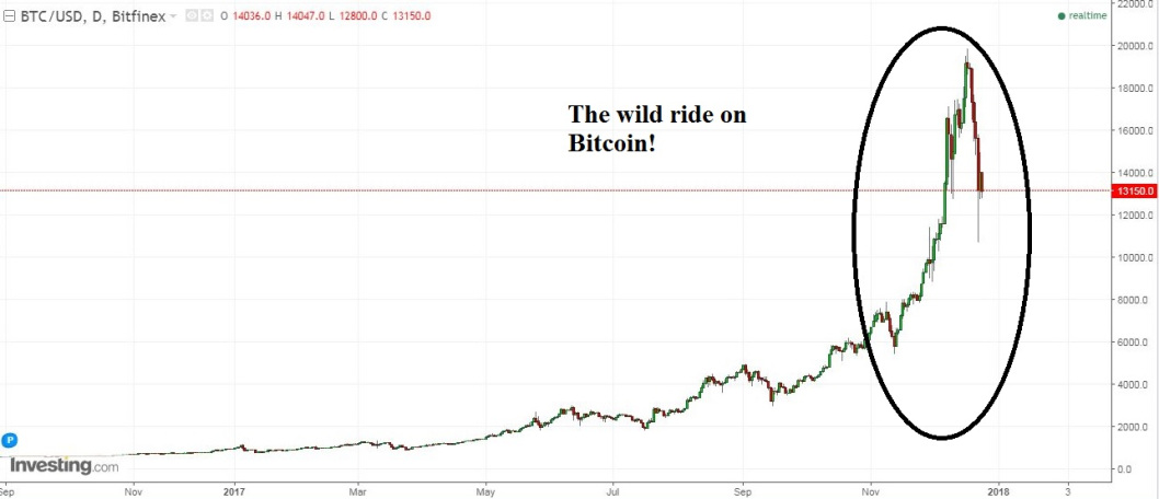
Figure 1: Bitcoin’s Wild Ride!
Whew! What a ride! One could get exhausted just looking at it. Wouldn’t it be nice if we could trade a nice, steady, calm and peaceful chart like Figure 2’s, for similar returns?
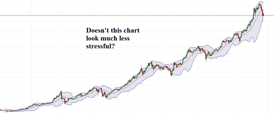
Figure 2: A Much More Peaceful, Bullish Chart
What if I told you it was possible? What if I told you, in fact, that it was possible to obtain exactly the SAME returns from the second chart as Bitcoin? Don’t look so surprised. It IS the exact same daily Bitcoin chart. Don’t believe me? See Figure 3. It is the same data, plotted using a log scale. That means that it has been re-scaled so that the rises and falls are similar in percentage terms. In fact, whilst looking at the chart, note how uniform the pullbacks have been since the beginning of 2017.
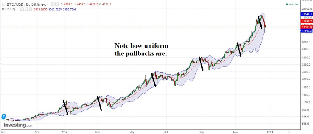
Figure 3: Bitcoin’s Daily Chart, Log Scale
It is funny how the more the world changes, the more it stays the same. In the world of stocks, this is an old trick. When an instrument has been rising (or falling) sharply in a short period, it is more logical make percentage comparisons than with numbers. That is what the log scale is designed to do. Note how much more clearly the earlier swing are displayed in this format. Note also how the latest “crash” in Bitcoin is simply a pullback of comparable log terms to retracements that have been occurring since the beginning of 2017. Would you call it a crash now?
Bitcoin may yet crash – nobody knows for certain. However, I wish to point out that inexperienced traders who focus just on the numbers will experience far more fear and greed than the ones who focus on percentage returns, which is what matters for long term survival. Make your decisions carefully, and may the trade be with you!
With my very best season’s greetings,
Kaye Lee
Head Trader Consultant